︎︎︎ Back Forward ︎︎︎
Bingo’s Market Relaunch
Branding & Illustration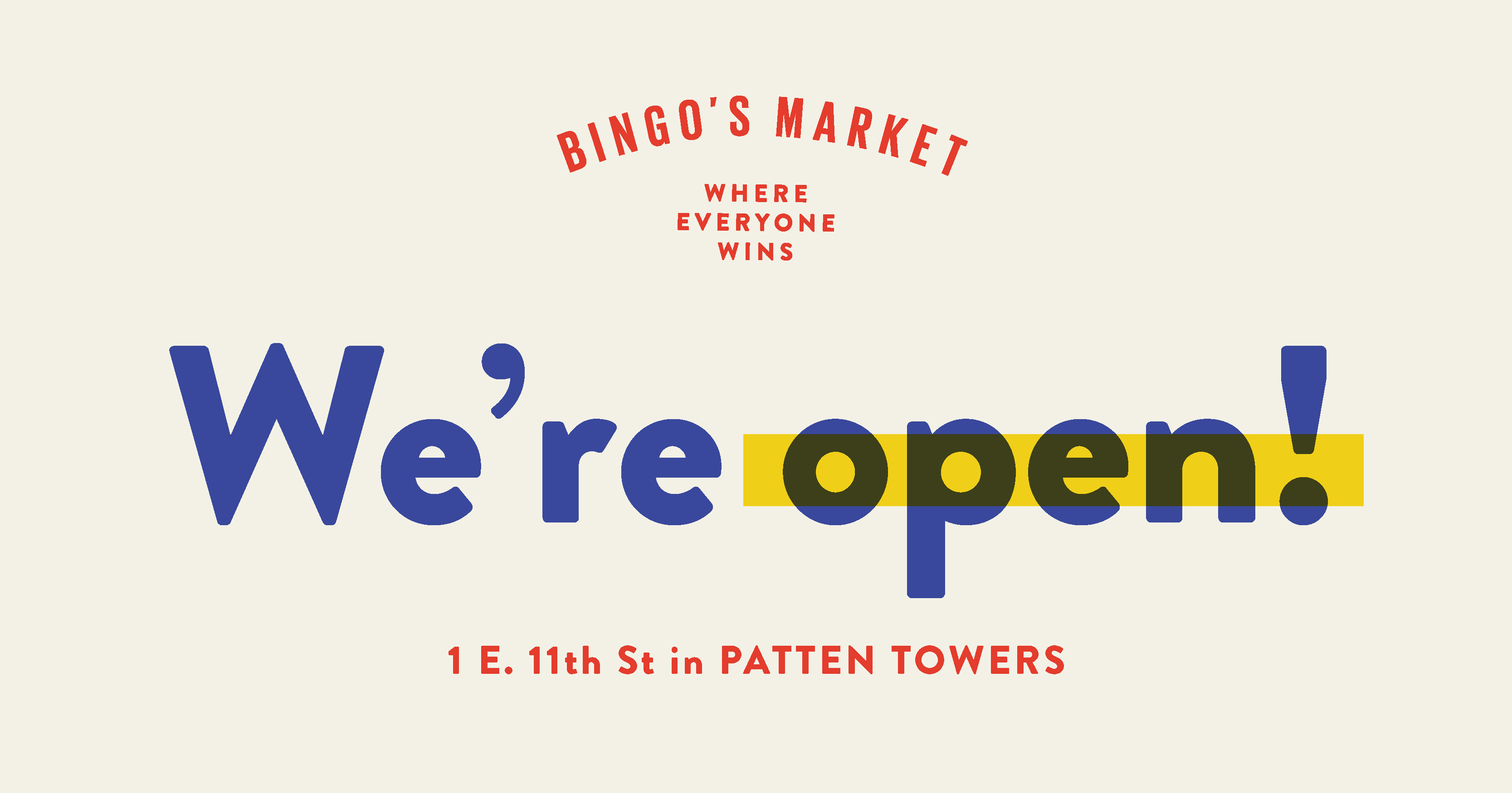


Project Type
Client Project
My Role
Illustration
Typography
Prototyping
Tools
Adobe Creative Suite
Sketch
Invision
Duration
3 months

Behind the Brief
Bingo's Market is a community-centric grocery store located on the ground floor of Patten Towers in Chattanooga, Tennessee. Built on the mission of providing accessible nutritious foods, Bingo's democratizes wellness for a wide radius of consumers, regardless of background.
The corner grocer's brand references the weekly bingo night hosted in the community center next door. Naming the Corner Grocery 'Bingo's' pays homage to the value of community and food abundance to the surrounding community. The lighthearted activity of playing Bingo symbolizes togetherness.
After lengthy closures due to the pandemic and funding, Bingo's Market celebrates a reopening as a start to a new era and invites the community to celebrate.
Process


In preparation for their reopening, I collaborated with multiple designers to develop attractive merchandise for Bingo's Market Relaunch. My responsibilities included creating deliverables for digital platforms, conceptualizing merchandise, and expanding Bingo's existing branding.
As a design team, we continued the playful and inviting vision of the original bingo campaign while pushing new iterations through the signature circle stamp icon and the graph motif of bingo cards. We collaborated on new marketing strategies and explored additional tactics utilizing previous illustrations and typography. I interviewed previous customers, crew, and Chattanooga natives to align our design solutions well with Bingo's existing brand.
Final Solution


Application


